CR
How do your products represent social groups or Issues?
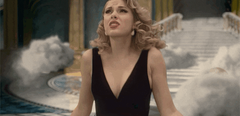
The film Maneater is unlike many thriller films, challenging the social norms of the man being dominant in society (gender inequality) In the film industry women likely aren't taken into account as the dominant ones, being the protagonist. Mostly, they are likely defeated by their male enemy. Unfortunately in many films, including thrillers, males are the dominant gender biologically and they tend to win a fight both mentally and physically. Our short film features Nelly Ferguson and Kyle Nelson on a mission to hunt each other down and kill one another as a part of each other's mission instructed from their agency. Throughout the film Kyle is seen trying to undermine Nelly into poisoning her. Nelly detects this deceiving act and throws away the poisoned chocolate “gifted” to her by Kyle. At the end of the film, they are both seen getting into a fight with a knife, Kyle winning at first, then Nelly eventually taking victory and killing Kyle. This challenges the norm and issue in our society that men are the dominant both physically and mentally. In our other products like the website, it is based around Nelly (a woman) as the killer. She is seen holding the knife, not Kyle, even though they are both trying to kill each other. We chose to do this to challenge the unfair issue of men always “winning.” The website also features a page where we included reviews. One of the reviews says “Maneater challenges the typical norms of a thriller. The female representation is what this generation needs, and the film brings this to light." This is also portrayed in the postcard where we feature the same picture of Nelly with the knife that she uses to kill Kyle. We chose to add a silhouette to emphasize the female power of our film. All of these products question that maybe men don’t always have to be the smarter and more devious ones in film and in life.
How do the elements of your production work together to create a sense of ‘branding’?
The elements of our production are consistent throughout our products to make them both aesthetically pleasing and easy to advertise. In the film we used a red front that would stand out to the viewer to make sure they know what they are watching and more importantly, who is in the film. This is carried out throughout the website and postcard. In the website we used a similar white front to show all the important information to our film. It is bolded to really illustrate the information we try to portray. Our Maneater postcard is the basis of both the website and the postcard itself. We used the front of the postcard in the website to show consistency throughout both products. We wanted people to know that the website is in fact linked to our Meanter film to advertise to all audiences. To stay consistent we also inserted the same instagram link in the website that we showed in the postcard. In the postcard to make it easier, we inserted a qr code that users can just scan that will bring them to our official social media account. Throughout all elements of production, we have a brand of scary or eerie. I would describe our brand as red if it were a color. As you make your way to the website, each heading you click on makes the whole website page flash red to stay consistent with the theme. This red aura is brought over to the postcard where we have a silhouette of Nelly on a light red, bloody screen. Blood is seen dripping on this page on the front and back of the postcard. We included this on the cast and crew page on our website as well to create a sense of our unique branding. The goal was to ultimately color coordinate to compete in the market of films.
How do your products engage with the audience?
There are many audiences for films like Maneater. Being a thriller, we get the audience that maybe likes the feeling of sitting at the edge of their seat and waiting for something to happen. Our products engage with this audience by staying consistent throughout the film, website and postcard. In the film, we use a red font meant to stand out to the audience. In thrillers, much like horror films, the color red is used to create a sense of fear and deepen the emotion you feel when you see it. It also created a sense of suspense which is what thrillers are all about. Our color schemes throughout all products work together to please every audience. Our products, specifically the website and postcard are also easy to navigate. This characteristic would engage the audience as they do not have to work hard to find information about the film. The website has all the information needed in each heading. The home page tells you that the film is coming soon and if users scroll they will find an instagram icon that if they click, will lead them to our social media page in which they can follow and track updates even easier. The “about” page gives audiences a synopsis of the film so they know right away if it is a kind of film they would be interested in viewing. That same page also features information about where and when you can view the movie in real time once it is officially released. In our “more” heading, viewers can see our cast and crew and what each person was incharge of. It also features reviews of our film that would possibly appeal to audiences and entice them to view our film. The postcard is basically a combination of our website's information. It shows clear information on our film in a creepy font that would draw in viewers.
How did your research inform your products and the way they use or challenge conventions?
In my research, we researched a variety of genres including horror, action and thriller. After much consideration, we came to find thriller would be the best match for what we wanted to accomplish. Action would have costed too much money and with our busy schedules, we wouldnt have had enough time. Thriller was the perfect fit. I found that thrillers have specific conventions. Those supported and influenced how we edited our film as well as how we made our website and postcard. In the film, we used the technique of close ups to emphasize the suspense. While researching we found that both diegetic and nondiegetic sound is an important part of the thriller genre and important to accelerate anxiety towards the viewer as they watch the film. This is essential in thrillers because the viewer should feel these emotions for the effect of the film to come through. In the movie scream, they have diegetic sounds like the sound of a phone ringing after complete silence. Another example in our film would be the use of the song Maneater. It doesn’t fully come off as a thriller themed song but by the end, we found a way to make it fit in. Our research done for the perfect song ended up working out perfectly to accomplish what we wanted. In researching we also found that as for a color scheme, red black and white would be the best to create a sense of eeriness.
link to CR-
https://docs.google.com/document/d/1grPrCCIqPoorddweJfQwskV1Uxuwwy5VWS33oa64_UE/edit
Comments
Post a Comment